Questions on Data Interpretation

Data Interpretation - Sub Topics

  • What is Data Interpretation?
  • Types of Graphs
  • Solved Questions on Data Interpretation
  • Questions to practice on Data Interpretation
  • The reading material provided on this page for 'Data Interpretation' is specifically designed for students in grades 9 to 12. So, let's begin!

    What is Data Interpretation?

    Data interpretation is the process of making sense of and understanding the meaning of collected data. This may involve analyzing and visualizing the data, identifying patterns and trends and drawing conclusions or making predictions based on the data. It can be used in a variety of fields, such as business, science and social sciences, to make informed decisions and improve decision-making. Techniques used in data interpretation include statistical analysis, data visualization and machine learning.

    Data Interpretation problems can be asked in various patterns. Which include, types of graphs:

    1. Bar graph
    2. Line graph
    3. Pie chart
    4. Tabular data interpretation

    1. Bar Graph

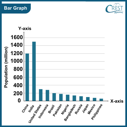
    A bar graph is a type of chart that uses a horizontal or vertical rectangular bar to represent data. It typically consists of two axes: the x-axis and the y-axis. The x-axis, also known as the horizontal axis, represents the categories or variables being compared. For example, if the bar graph represents different countries, the x-axis would list the names of the countries.

    The y-axis, also known as the vertical axis, represents the numerical values or measurements associated with each category on the x-axis. It indicates the scale or magnitude of the data being represented.

    For example, The bar graph represents the population of different countries, the y-axis would show the population values.

    1bar-graph

    2. Line Graph

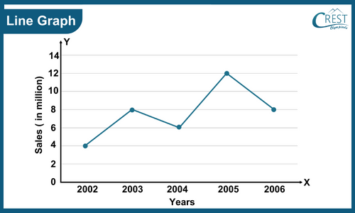
    A line graph uses points connected by lines to represent data and shows the relationship between two variables. The x-axis represents the independent variable, the y-axis represents the dependent variable, and the lines connecting the data points depict the trend or pattern in the data. Each data point in a line graph is represented by a dot or marker on the graph, and these points are connected by straight lines. The line connecting the points helps to visualize the trend or pattern in the data and allows for the interpolation of values between data points.

    For example, the line graph represents the sales of a company in different years and the y-axis would show the sales values.

    line-graph

    3. Pie Chart

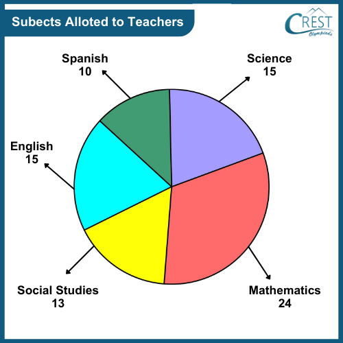
    A pie chart is a circular statistical graphic that is divided into slices or sectors, each representing a proportionate part of the whole. It is commonly used to display categorical data and show the relative sizes or percentages of different categories within a dataset.
    The pie chart is composed of various wedges, with each wedge representing a specific category or data point. The size of each wedge corresponds to the proportionate value it represents in relation to the total. The total of all the wedges in the chart always adds up to 100% or 360 degrees, representing the entirety of the data being displayed.

    For example, The pie chart shown below represents the number of marks obtained by students in different subjects.

    pie-chart

    4. Tabular Data Interpretation

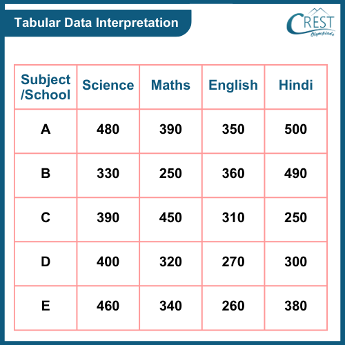
    Tabular data interpretation refers to the process of analyzing and making sense of data presented in a table format. Tabular data consists of rows and columns, with each row, representing a specific record or observation, and each column representing a variable or attribute.

    For example, The table data interpretation shown below represents the total marks obtained by students in different schools for different subjects.

    tabular-data-interpretation

    Share Your Feedback

    CREST Olympiads has launched this initiative to provide free reading and practice material. In order to make this content more useful, we solicit your feedback.

    Do share improvements at info@crestolympiads.com. Please mention the URL of the page and topic name with improvements needed. You may include screenshots, URLs of other sites, etc. which can help our Subject Experts to understand your suggestions easily.

    Mental Maths Related Topics

    70%